Typography leads the composition
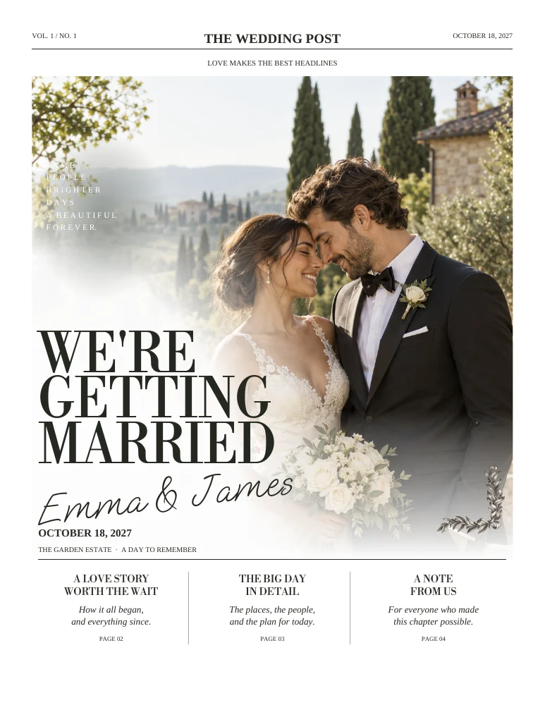
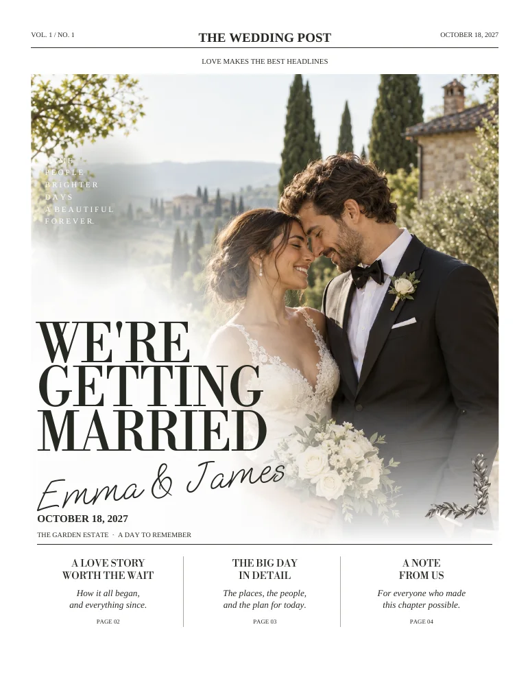
Large serif headings establish the page before smaller details take over. Write short headlines that fit the intended hierarchy. A clear title and a compact introduction work better than a long sentence squeezed into the cover.
A warm palette without visual noise
Graphite illustrations, fine rules and engraved decorations support the photographs. Choose images with related tones, but let real memories matter more than perfectly matching every color. The white PDF background also leaves the paper choice visible in the finished print.

Explore both editions
Four pages cover the essential story of the day. Eight pages separate the story, how you met, the celebration, your people, the table and the thank-you. Open both sample PDFs and judge the spaces available for your own content.
Carry the style into the room
Pair the newspaper with Classic menus, signs and place cards. Keep recurring wording consistent, especially names, date, venue and table labels. Matching design is most useful when it makes the collection feel familiar to guests.
ON THE PAGE
A closer look at the design.
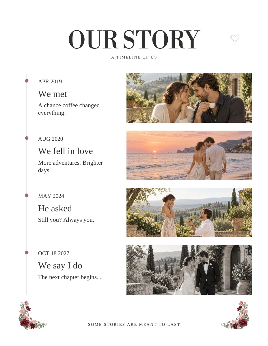
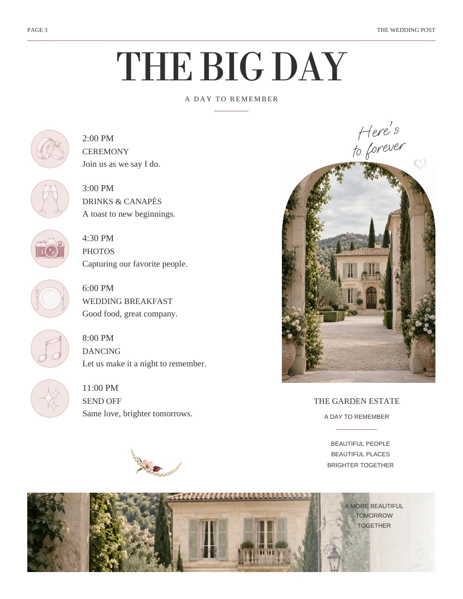
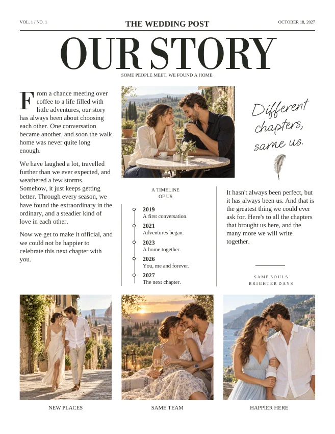
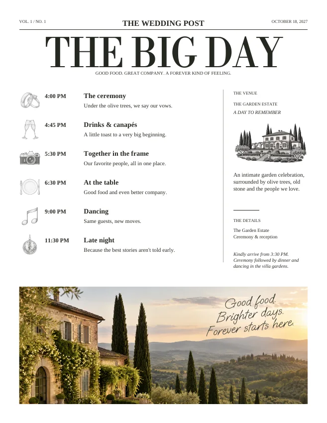
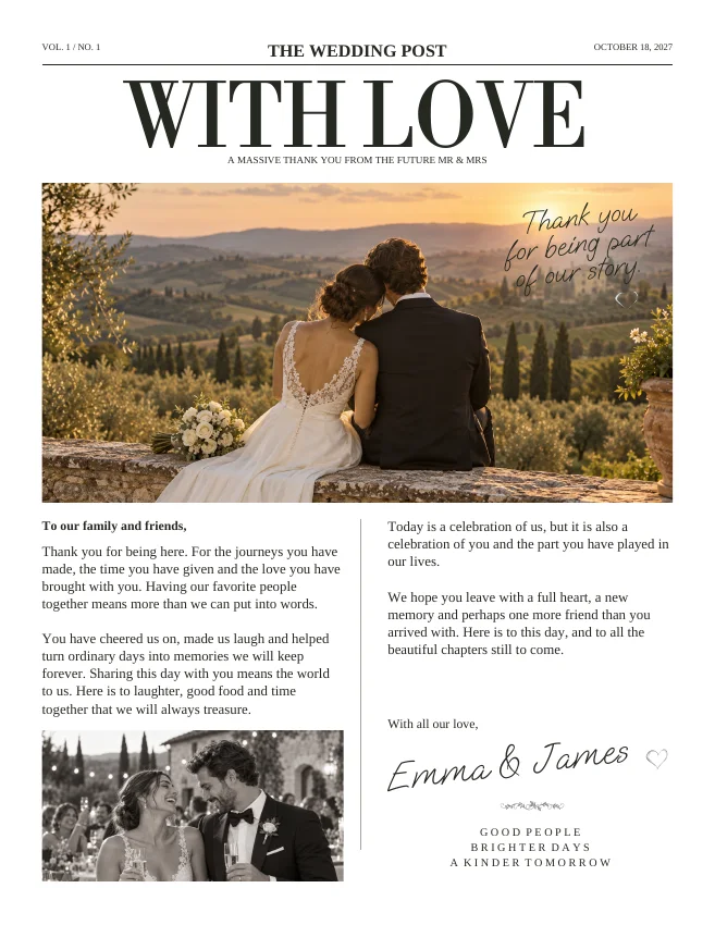
Actual sample pages from Editorial Classic. Open a page to explore the PDF. Replace the fictional details and sample photographs with your own.
KEEP IT SIMPLE
Before you make it yours
- Short editorial headlines
- Original photographs with clear subjects
- Graphite decorations used sparingly
- Consistent names and dates across pieces
GOOD TO KNOW
A few things you might be wondering.
Is the PDF background cream?
The sample product pages use a white background. Paper stock can affect the final printed appearance; inspect a physical proof.
Can I see the inside pages?
Yes. The public four- and eight-page samples show the complete layouts.